
I was lucky enough to partner with NIU Athletics for the 2021-22 school year. Together, we developed a seasonal look and art direction to help guide creative for the upcoming academic calendar.
Taking some time to really get to know the Huskie brand, I learned a lot about the environment and tradition found at Northern Illinois University.
Keeping in mind their current brand, core audiences (fans, donors, recruits), and department wide initiatives - I presented three mood boards as options for a potential art direction. Each of these mood boards focused on a different aspects ingrained within NIU Athletics.
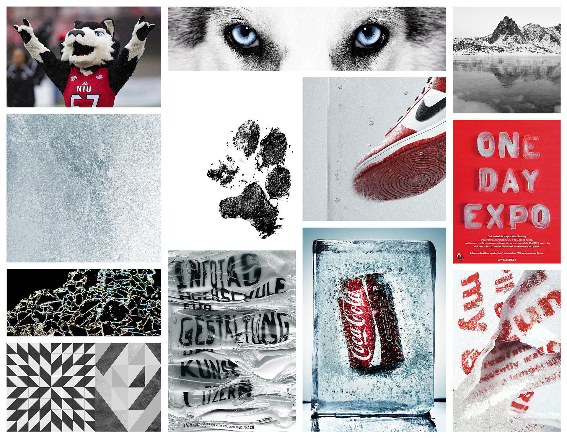
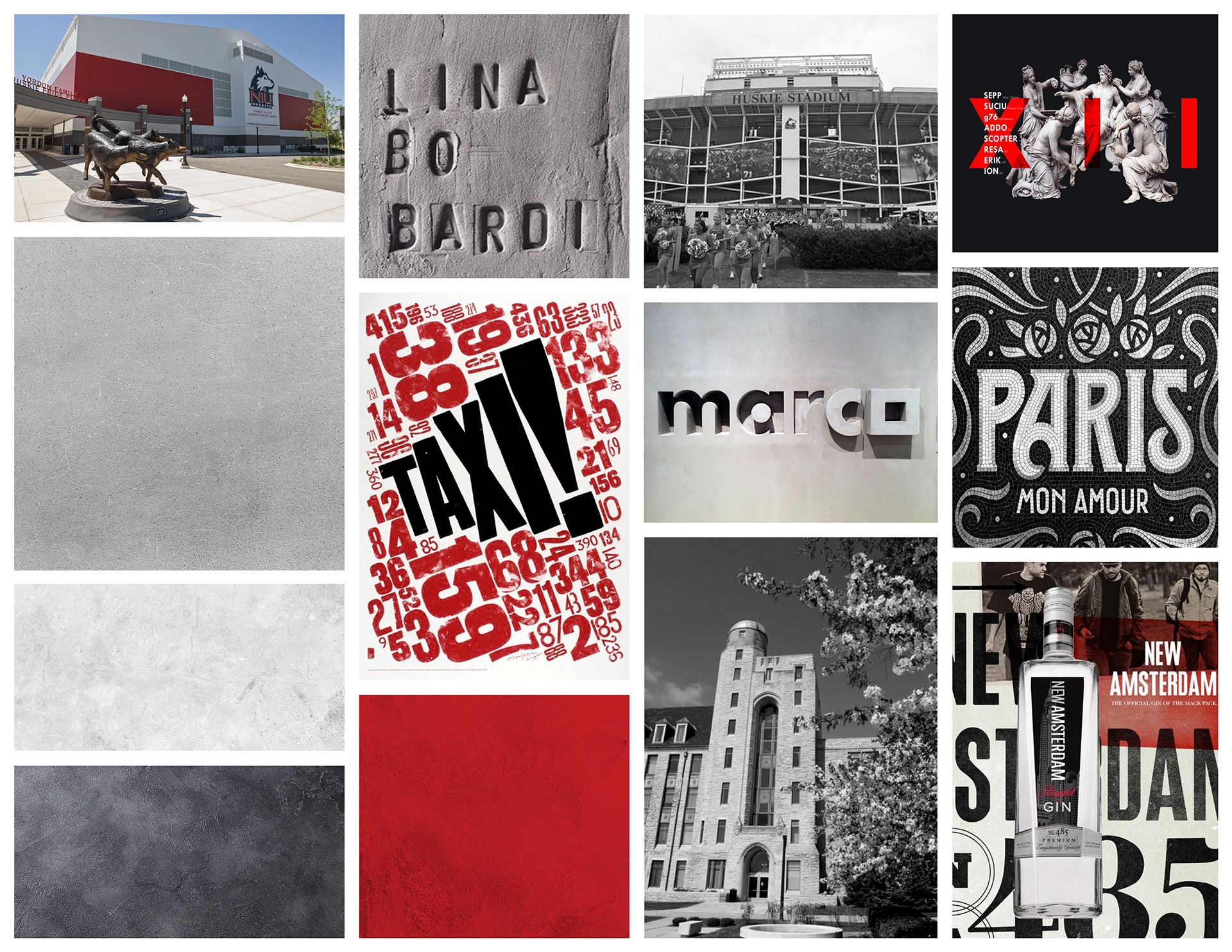
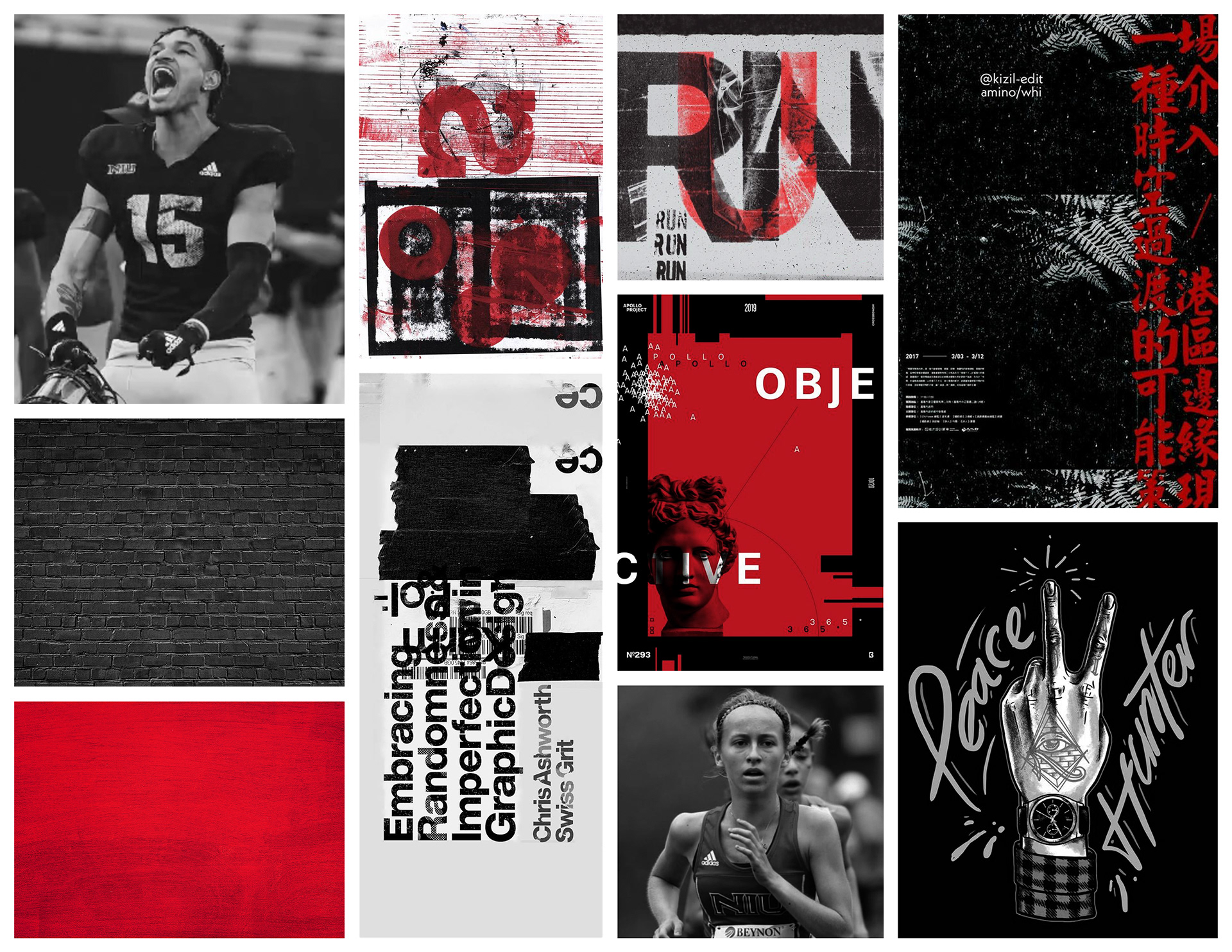
After reviewing each option, NIU Athletics chose mood board 3. This particular mood board focused on one reoccurring theme found within their department: the hard-working mantra surrounding Huskie Nation.
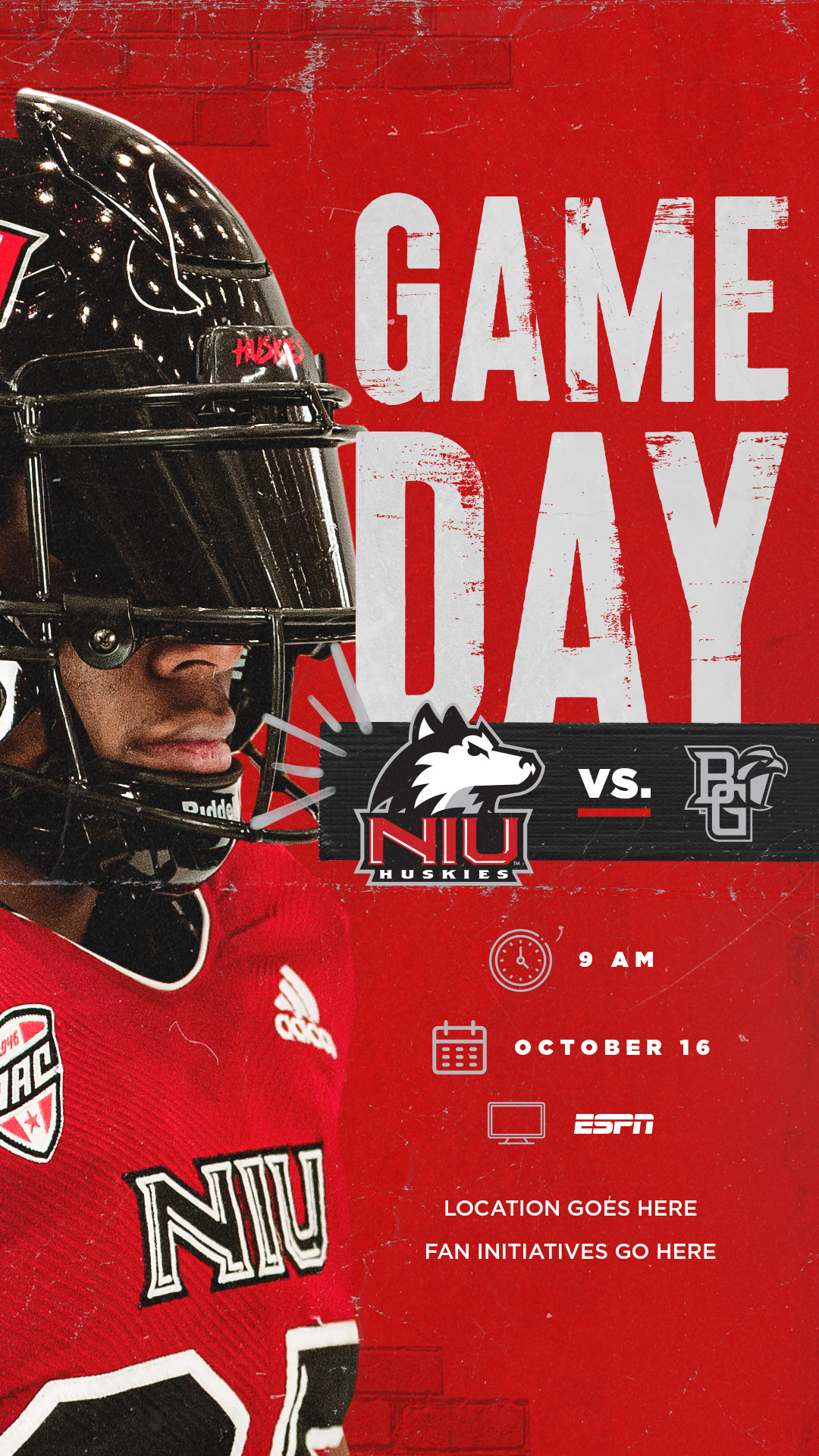
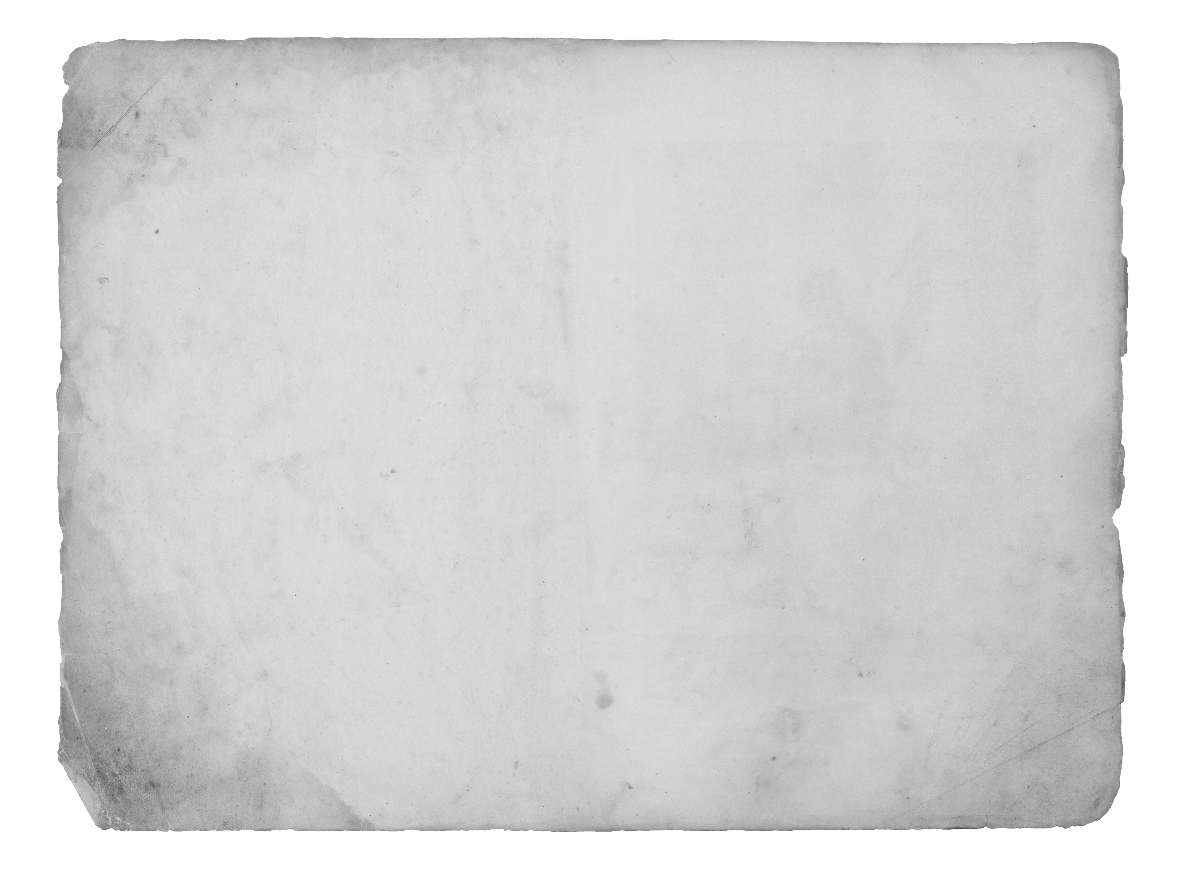
Whether it’s athletes grinding on the field/court or in the classroom, being a part of Huskie Nation means always giving your all. In this art direction, the grunge represents the hard work that the athletes put in each and every day to be able to proudly wear the NIU letters on their uniforms. The use of dark brick, film grain and paint allow for a grunge look that represents toughness and resilience that can be found within NIU Athletics.
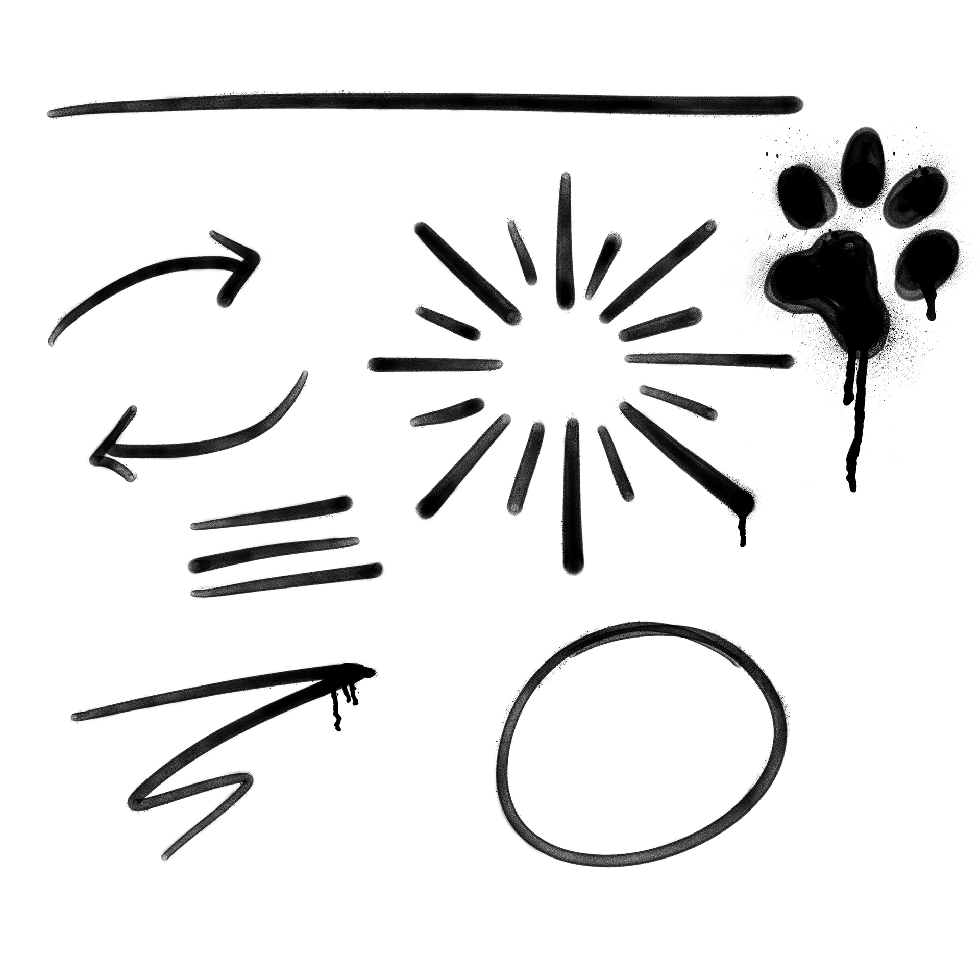
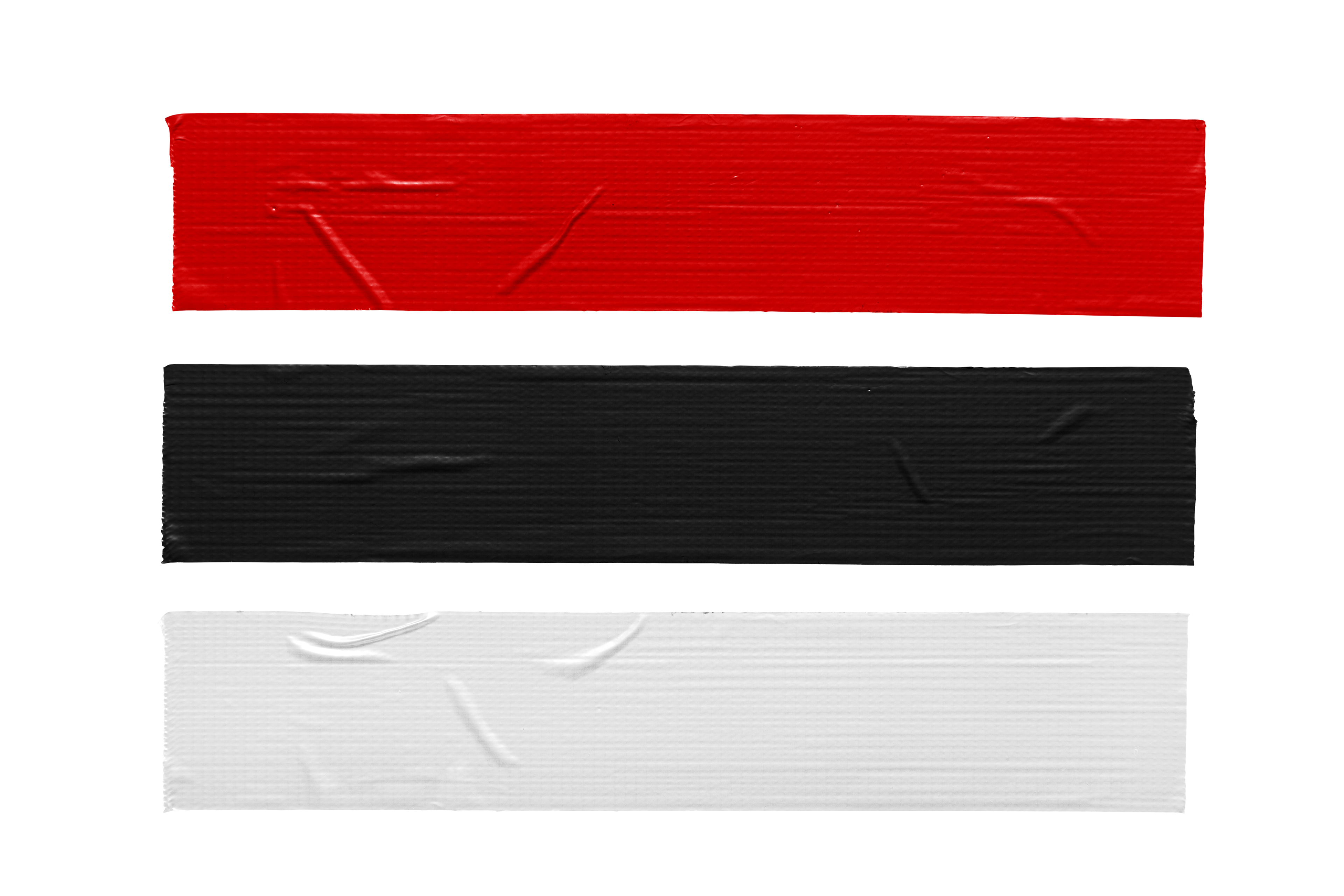
A combination of textures and design elements were then chosen to align with this mood board and art direction.
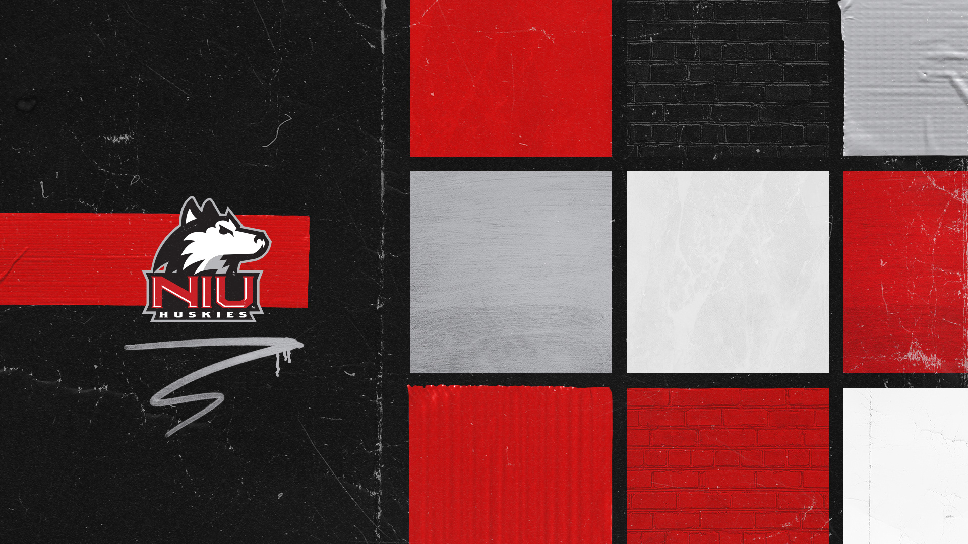
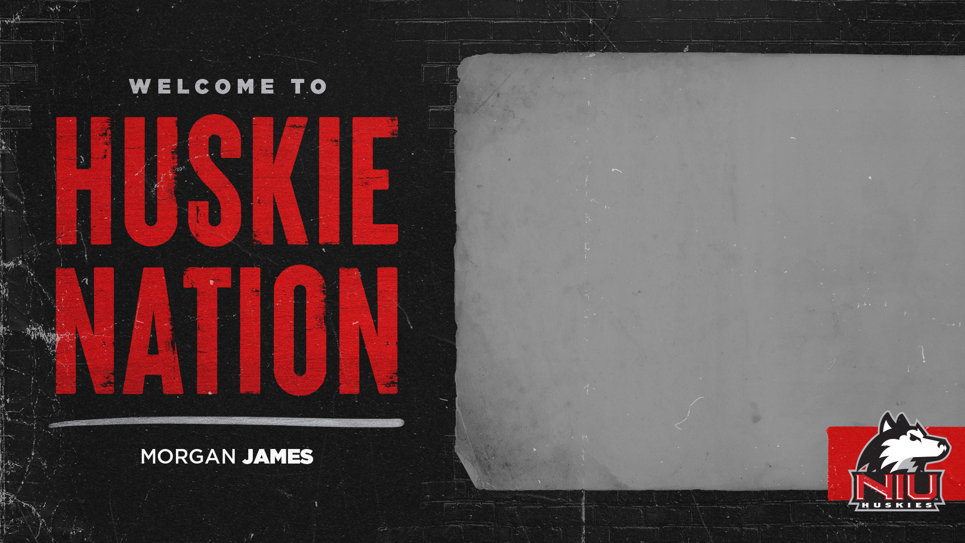
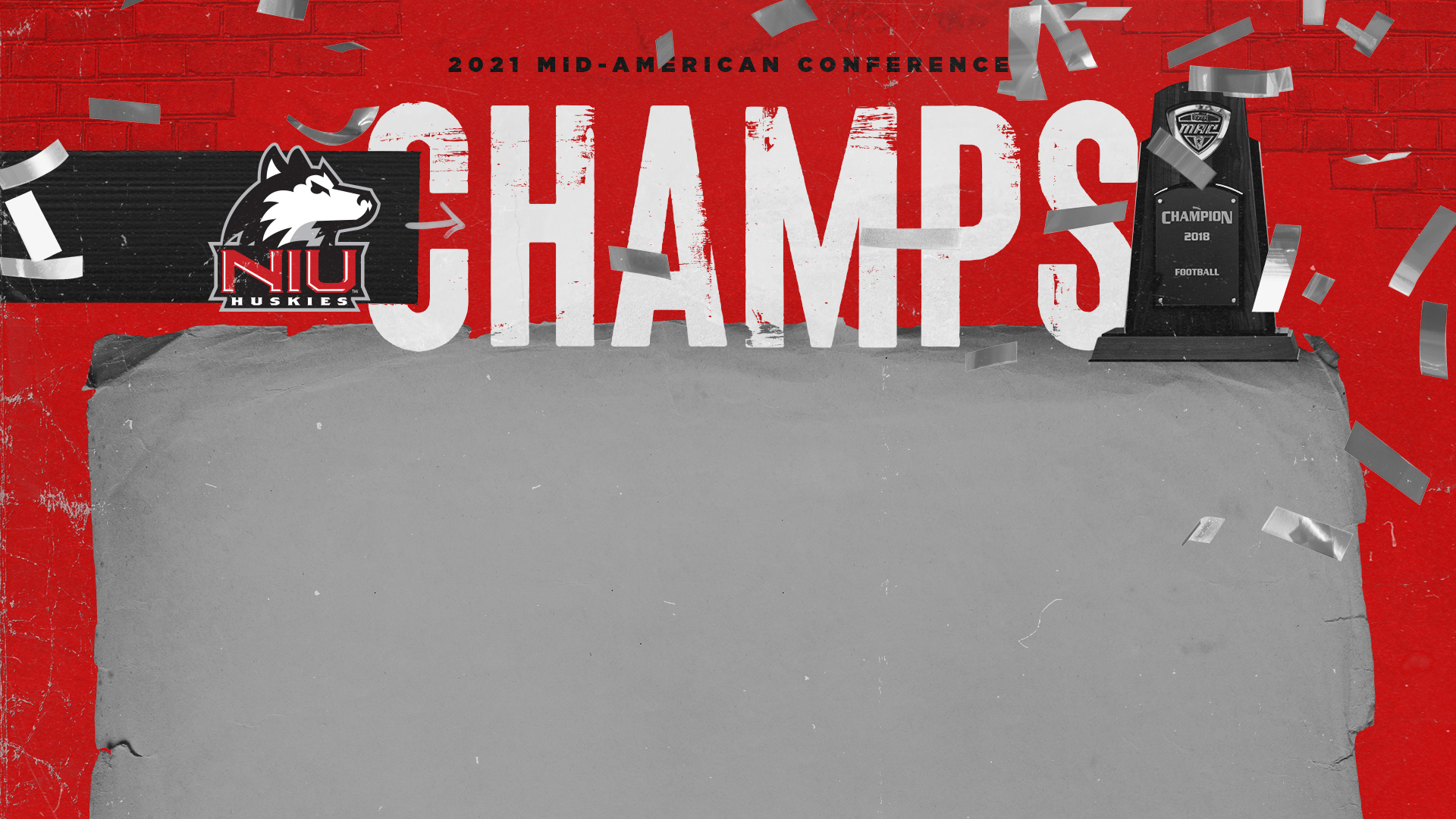
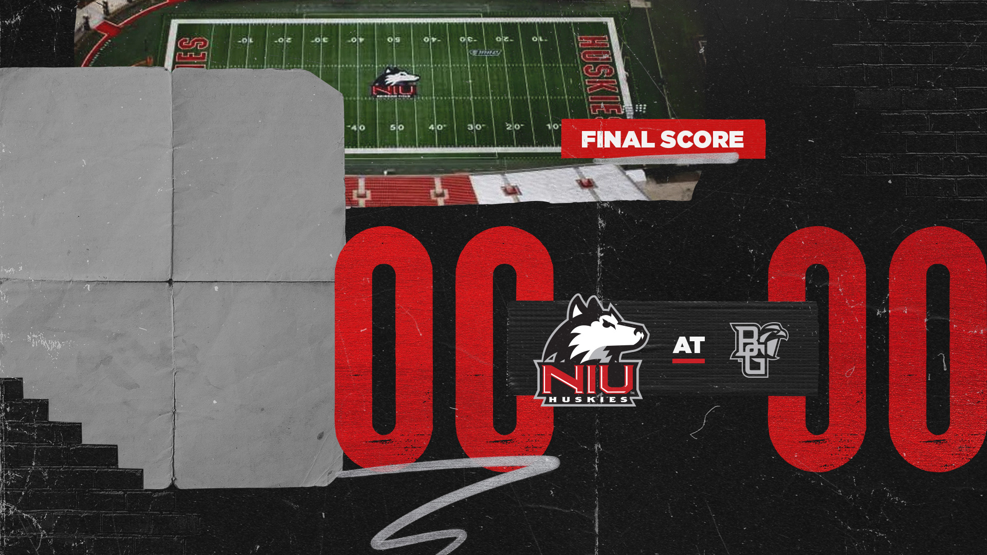
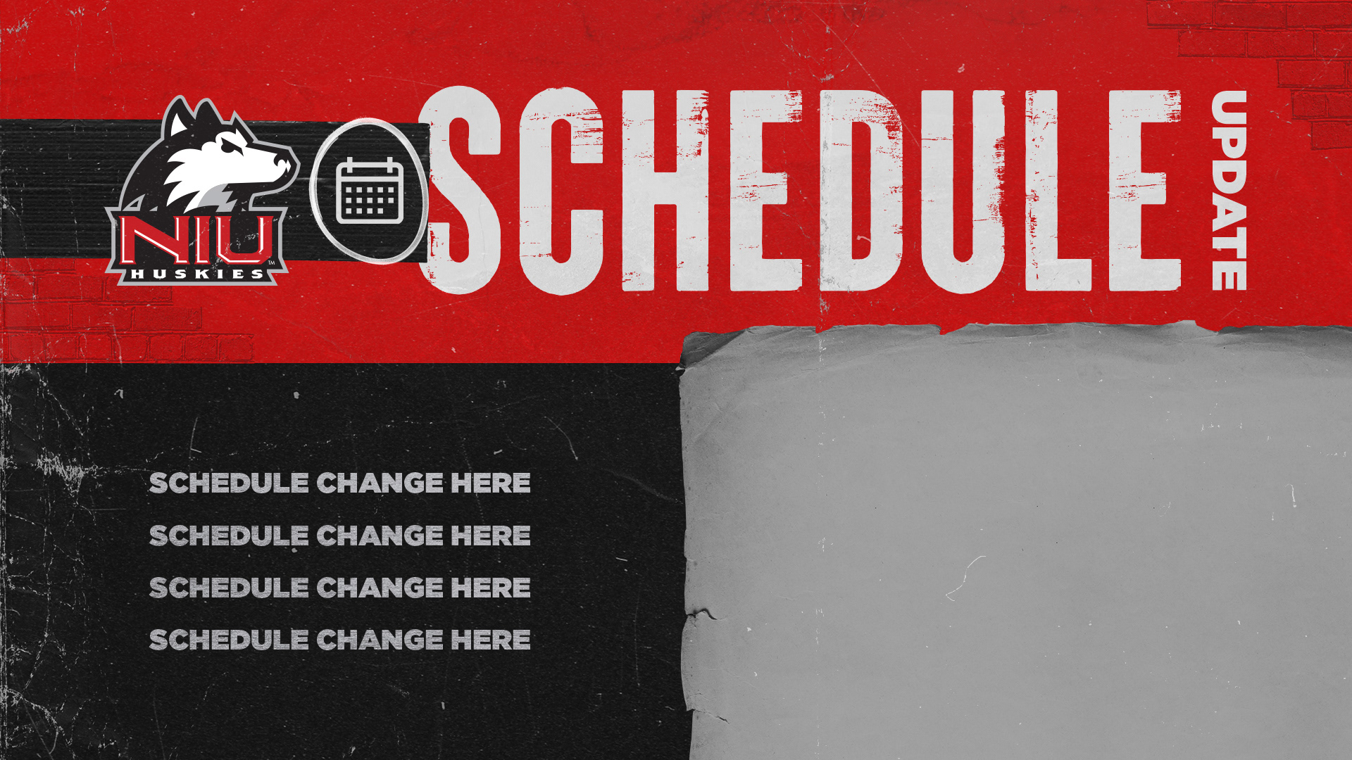
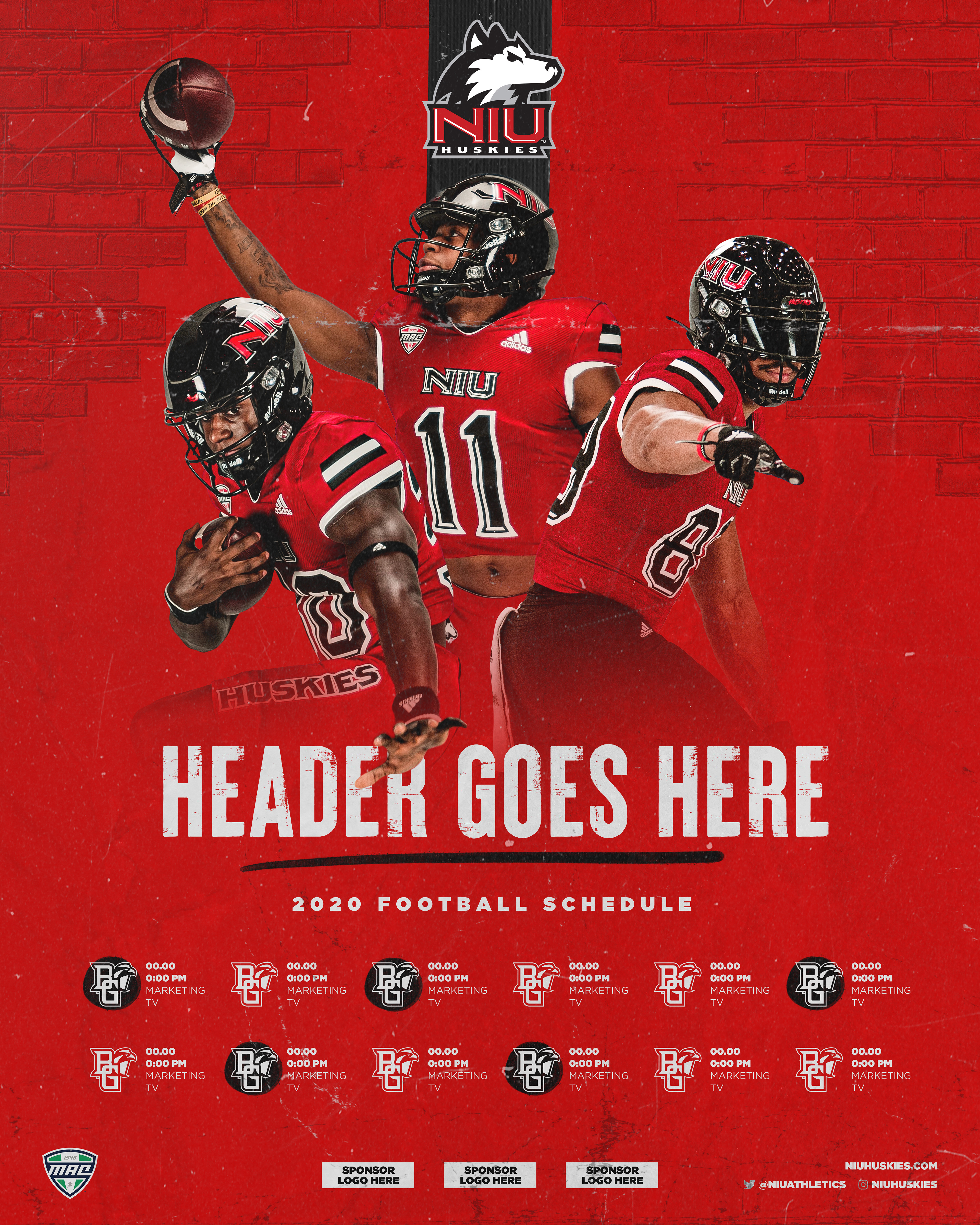
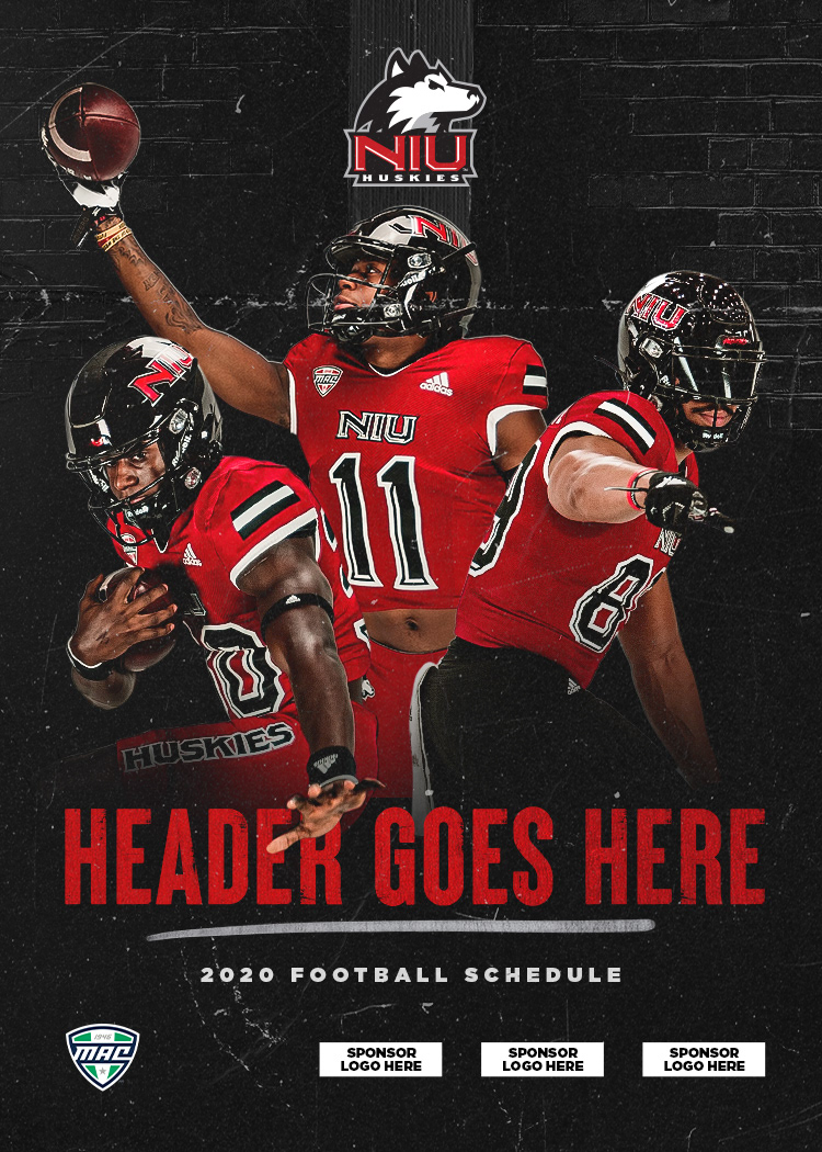
An initial template was then created as a starting point to guide art direction.
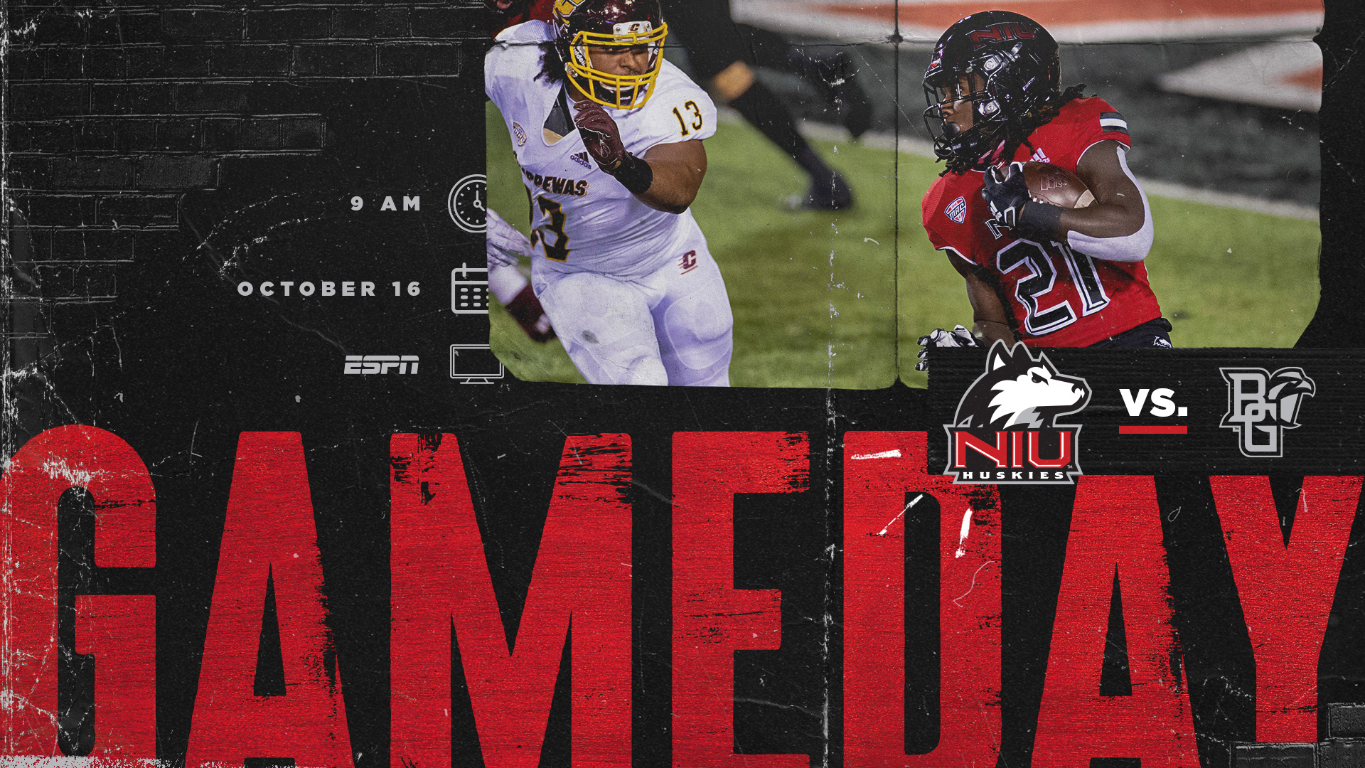
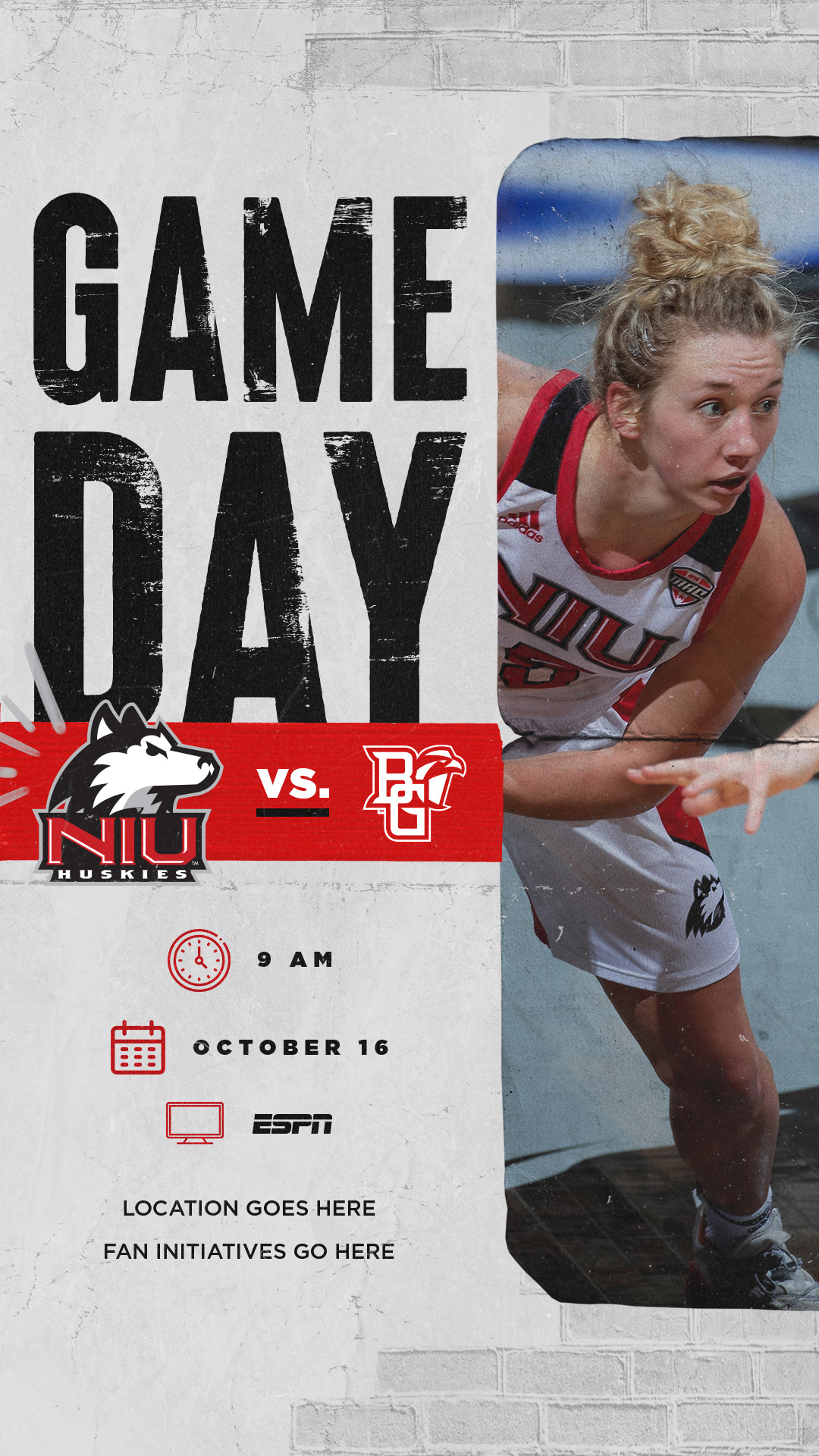
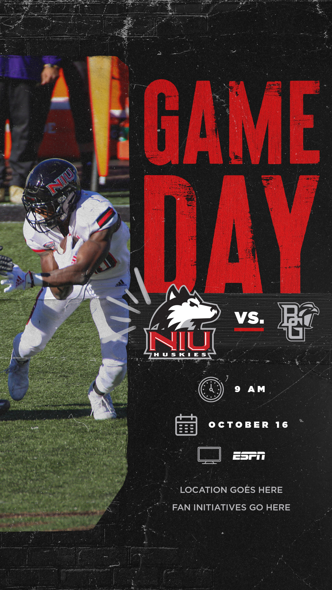
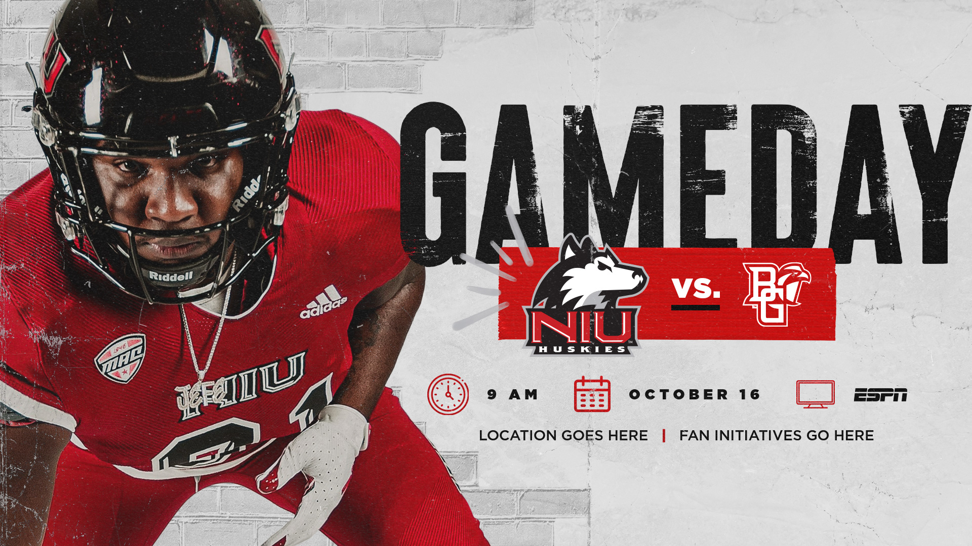
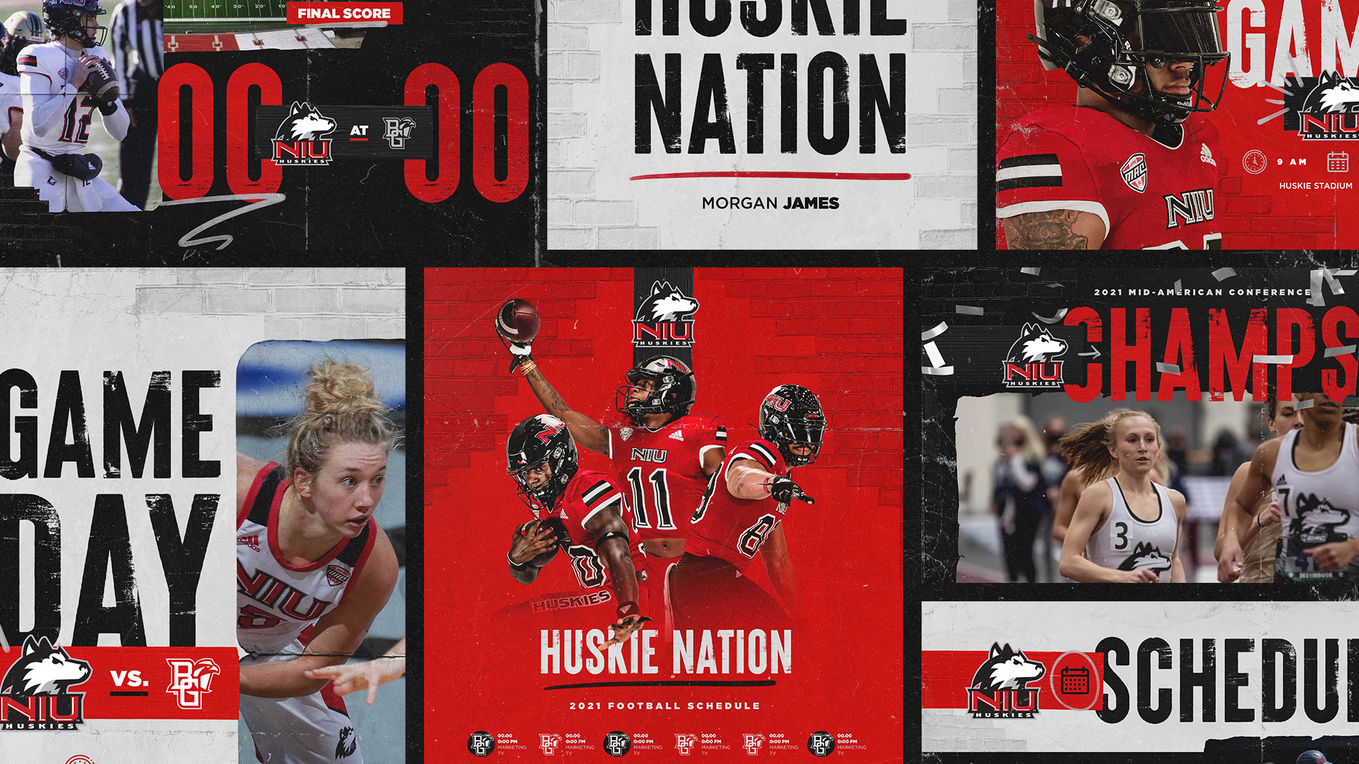
Once the final art direction was determined, I worked alongside NIU Athletics to mock up additional templates to help give them a jump start into their new brand.
Each template was created in three color variations as well as two different sizes to allow for a large toolbox of design assets and files that were set up, ready to go, for any staff member to easily use